Wednesday, 27 October 2010

Take Flight

Take Flight
Winter 2010


You only get one life...Take Flight and discover as much as you can.

Wednesday, 20 October 2010

My entry didn't get picked...

So here you go!

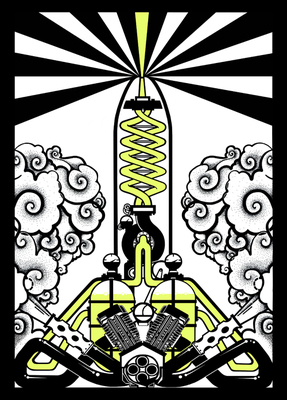
'GUN!'


Above is the original colour (glow in the dark) which was sent....

2 months of knuckling down to be told "its not quite right for the show" :'( I can understand though...maybe a bit to naughty or something! :S Gonna keep trying to get into a London show though .... or anywhere really! I need a break yu know? Keepin' my chin up though so don't worry.

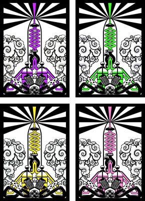
I've been experimenting with photoshop this evening and oddly enough the colours I thought would work really well looked like shit! So....I sat and thought / played with colours for a while and finally came to the conclusion that it would be awesome to have colours named after favours of sweets....


Sour Apple, Grape, Bubblegum and Banana! (With one unique colour print to be announced!)

So yeah.....blue, red and yellow didn't feel right as a set :S which at first was a little bit worrying as my heart was firmly set on those colours...so glad they didnt work though! Because I'm SO friggin' happy with the set above - my pulse is going crazy thinking about getting them printed!

These prints will be available from my etsy shop....The openning was going to be this month however due to my limited funds I can only hire out the print studio once a month so it looks like I'll be unveiling my shop in Spring next year :( Don't worry! I will keep you guys posted so you can check it out :D

Sunday, 17 October 2010

'Big Brother Is Watching You'

Big Brother Is Watching You
Autumn 2010
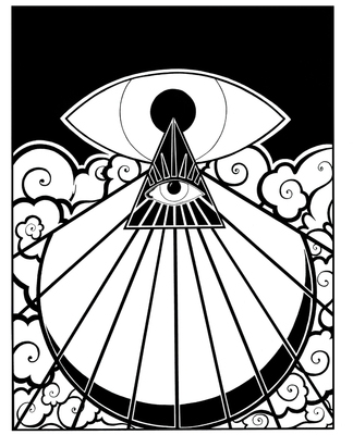


I guess you can call my most recent piece 'white work' rather than 'black work' I wanted to try using areas of white more dominantly...I think I prefer the heavier use of black with white as negative space though. There is something I like in the blocky bold areas of black which white areas dont seem to achieve. Also the white areas dont seem as imposing as I would like.

Not to say I dont like the 'white work' its just I feel more connected as an artist to the darker pieces. They seem more fitting to my style.

...........

The next couple of pieces I plan to work on are currently revolving around themes of leaving somewhere, moving forward with life, taking flight and following your dreams / your heart. In this series I aim to illustrate what I feel in my life at the time....

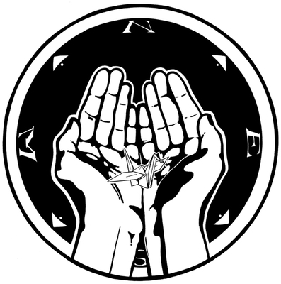
So I'm experimenting with the meaning of gestures with hands and iconography. Simplifying thoughts and feelings into minimal visual components. I try to get what I want to say to the veiwer by using one or two visual aids, for example: Lost Transmission only uses 5 visual aids to get the meaning across. Hands (x2) to represent individuals, untied ribbon (x2) to represent a broken link and a circle (1) to represent the earth and distance....
I feel if there are too many visual aids the meaning of the piece becomes very lost so therefore by sticking to no more than 5 or 6 this makes the piece much stronger.

I've been trying to use this method of thinking in all of the work I have created so far and it seems to be working well for me.

I'm not too far off finishing another piece so watch this space....
Friday, 8 October 2010

Lost Transmission

New piece - Lost Transmission.
Autumn 2010


.............

Also got around to turning my alcove into a art area, finally dont have to draw on my bed anymore...


Yes.

I'm always this messy.